

Apartment Community Marketing Refresh
This project was developed to improve how pricing and key information are communicated for an apartment community. The design process focused on clarity, transparency, and brand cohesion across print and email materials. The final deliverables demonstrate strengths in layout design, visual hierarchy, and creating client-friendly marketing assets for real-world use.
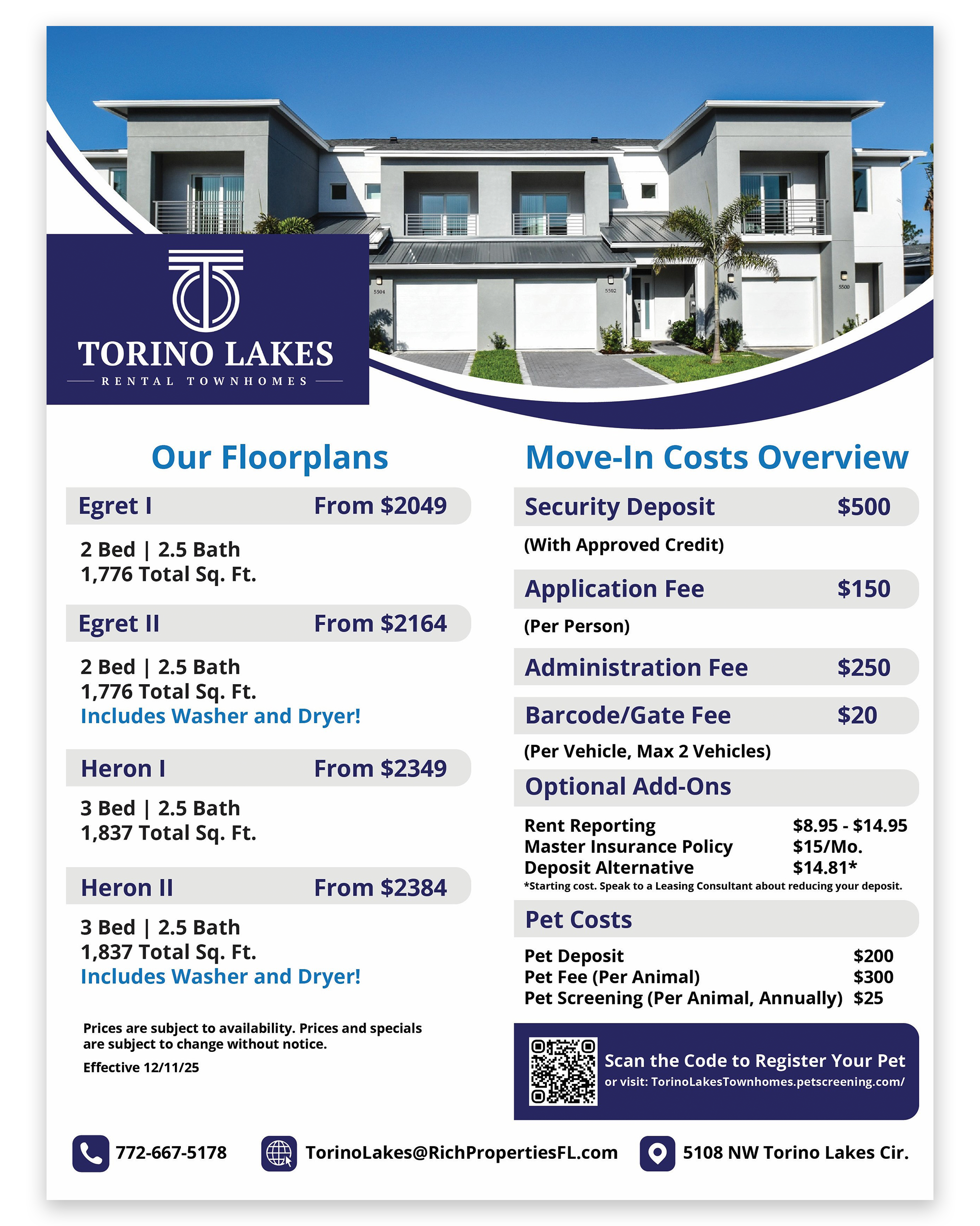
The first project in the series focuses on improving how pricing is communicated, transforming a cluttered pricing sheet into a clear, scannable tool that helps prospective residents quickly compare options and rates.
Before refresh
Cluttered, hard to scan, inconsistent colors
After refresh
Clean layout, and easy to compare rates
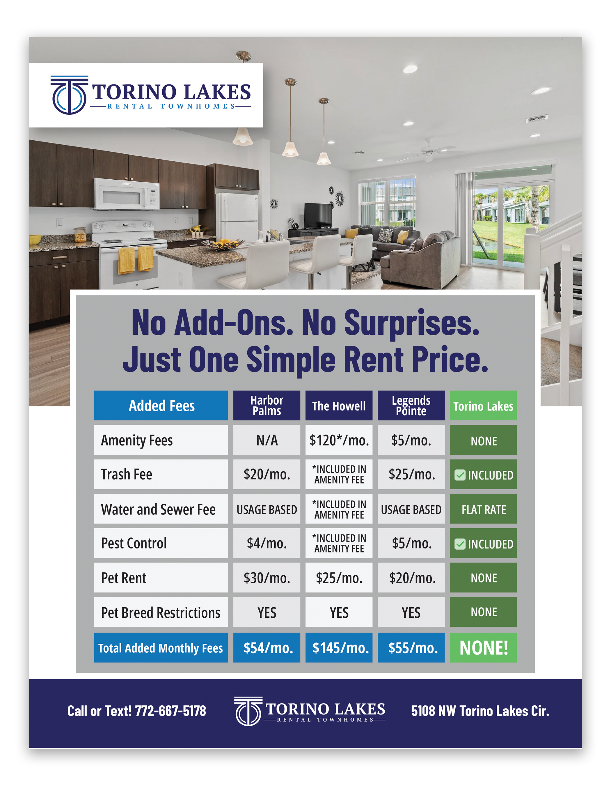
Next in the series, I designed a price comparison to clearly present unit options and highlight competitive rates. The layout emphasizes strong visual hierarchy and scannability, making key information easy to understand at a glance.
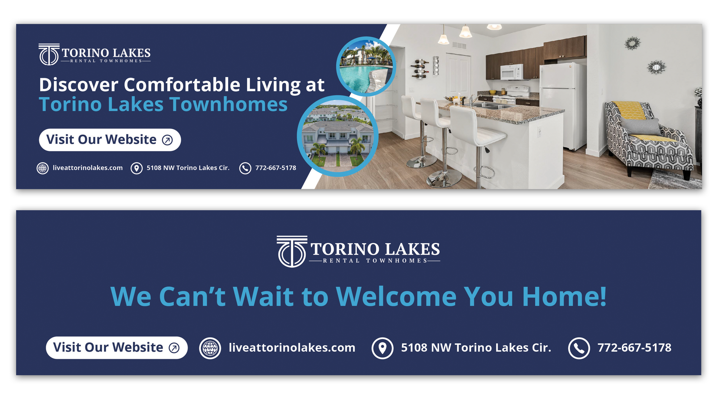
The final project in the series updated the email header and footer to create a clear, consistent, and brand-aligned framework for all resident and lead communications.
Tools Used: Adobe Illustrator, Photoshop
Skills Shown: Brand Consistency, Visual Communication, Layout Design, Digital Typography, User-Focused Design
Problem and Solution: Solved cluttered, hard-to-read communications → created clear, scannable, and consistent designs.